HASIN'S KITCHEN
_edited_edited.jpg)
HASIN'S KITCHEN - FOOD APP
ABOUT THE PROJECT
I had always a passion all about yummy foods and cooking related. With my dream to share with this world Hasin's Kitchen was born. With this platform I'm trying to promote halal Asian dishes by sharing easy and testy recipes, selling varieties of products online and in the near future I will offer a food delivery service to Mississauga area.
PROJECT DURATION
December 2021- Present
MY ROLE
UX/UI designer
UX researcher
User flow
TOOLS
The Goal
Hasin's Kitchen allowes user to easily place order with having fresh halal and yummy food in their doorsteps. It will provide pickup and free delivery options.

THE CHALLANGE

With Covid-19 forcing many restaurants to close. Also most of the people are working now from home. I saw an opportunity that why not I start a food business from my home. So, finally I have decided to act first and start healthy food delivering option to people's door. But I was really challenged to start this delivery options for Hasin's Kitchen as this is the first real life project where I am working for myself and growing a business for myself. This project is almost done with the UI/UX part and currently I am looking for a developer team. Already some people took part for the usability testing and the results was good. So finally it helped me to create final screen design. I'm very pleased to share some mockups with you.
USER CENTERED DESIGN PROCESS
Research
Concept
Prototyping & Usability testing
I began tackling the challenge by researching the existing food market. This includes Skip the dishes, Door dash they both are offering delivery services and also I had looked into Macdonald's app for digging up something new idea, that I can also use in my app to make it user friendly to all.
After successfully completion of research phase I moved into concept and requirement gathering phase of this app and that inspired me to sketch some possible solution of this app. I formed some screen design/ low fidelity wireframes that helped me a lot to move on my next steps.
The screen solution/ low fidelity mockups were used to design the final high fidelity mockups with clickable prototypes. I have asked some of my friends to participate in the usability testing phase and the final results helped me to move forward to make the final product and gave the final touch.
.png)

Research
Understanding the users
I conducted some initial interviews to some users who will be the primary users of the app and tried to understand their needs, pain points.
This user group confirmed initial assumptions of Hasin's kitchen app but what I have understand from the interview is time was not the only problems of these adults who has some busy schedule of their every day life but also they need fresh homemade food in their doorsteps in no time.

User Pain Points
Time
working adults are too busy to spend time on placing and waiting for the order in person.
Distance
Customers are unable to experience products at a cafe due to long distance
Finding user friendly app
The menu contains heavy texts and unorganized categories.
Health safety
Due to covid-19, physical distancing is a big issue. To ensure health and safety users want home delivery option.

User Persona
Andrew is a busy senior graphic designer who needs a faster, home made fresh food, free home delivery and more effective way to order food in his lunch break.
.png)
Laura is a freelance writer who works from home and needs to use food delivery service for ordering nearby cafe's products because placing her order at a café requires a long journey by public transport.

Competitor / Market Research
Skip the dishes

Very clear interface and it's very easy for the user to pick a restaurants. They have brief overview about ratings, delivery fee and how long it can take to be delivered.
I like the Reorder button, I think it will be a time saver for the users. But one thing in this page it is not showing about delivery options, like it was a pickup or delivery? so for the user it's little bit confusing.

In the first page they provide options at the top called Delivery and Pickup. For the first time user it is a bit confusing.
I like this options about view receipt. It's make very clear to user about their previous orders and the amount of money they spent.

Door Dash

I like this button, because it shows exactly about delivery and pickup before placing the final orders. No confusion at all.
I love the design of the footer of this app. It contains the main features which users search actually in one app.

Using map is so good and helpful for users because they can easily find and pick any restaurant whichever they want.
Overall I like the design of their interface and thinking of the way they design this app. Choosing any meal is very easy here.

McDonald's

I was totally confused about my app how to proceed actually and how can I make a very easy user-friendly app for my kitchen. But when I find out mcdonald's app, I looked very carefully to every page to remove my confution of making a user friendly design of a food app. They do not provide any food delivery by thenselves but I only used to research this app to find out the best way to make an easy interface for my customers.

Like me sometimes some people search for the amount of food calorie they are having in daily basis. So this option is very helpful for those people.
For Mcdonal's which I like the most is the way they make the categories of food. Very clear and easy to find out for any user. Also they show the food calories.


Concept
User Flow
Landing page
Choosing Meal
Payment
Confirmation
Solution Sketches


Here are some solution sketches for the app. Though this was the solution sketches used at first but I'm going to change some layout for making this app more easy and user friendly to users.
Landing Page

Menu

Choose delivery options
Checking Post code


Post code check
Pickup from store
Checkout
Log in/ Sign up option


Payment
Card Details
Payment
Confirmation


Prototype &
Usability testing
The Prototypes
Some clickable prototypes were made with the help of Figma. This allowed for people who had participated in the usability testing as it used to test from a mobile as it feels like realistic user experience for the participants.
.png)
.png)
Figma
Usability Tests
.png)
Some people took part in the usability testing.
All sessions were moderated and completed by in person.
I led the session by encouraging participant to share their impression of the screens as they saw them and focused on observing their reaction.
The results were good, because they found it very easy and user friendly.
Main Learnings & Takeaways
Landing page
Though Landing page layout was liked by the participants but some of them suggest me to mention somewhere or in the top that Hasin's Kitchen provides home delivery and they have also pickup option. So I'm going to mention it somewhere suitable into the landing page to remove confusions for the users.
Hasin's Kitchen will provide Halal food to customers. Some participents are suggesting me to use halal sign in landing page. Also I want to add a search button at the top to make this app more user friendly.
Adding Nutrition
Some perticipant were looking for the nutrition facts for the food they are ordering. So I have decided to make a new layout and one new button which will provide all the information about nutrition to users.

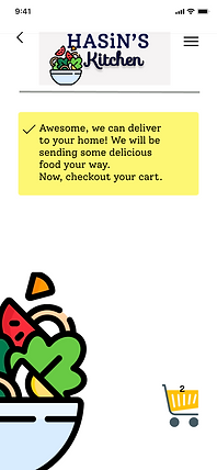
Confirmation Page
In the confirmation Page I want to add the option called View Receipt, so that users can see their order Receipt.
Also I want to add the button re-order at the confirmation page so that users can save time and they can make the same order very easily.
Responsive Design
.png)


.png)


Thanks for Watching!